Hertz Redesign
This design challenge was a part of my application process to IBM’s Patterns Design internship for Summer 2021. I was challenged to redesign the Hertz mobile app to make it better suited for a mid-career professional. This project focused on my abilities to conduct user research, translate user insights into improved interactions, and prototype in various fidelities.
Throughout my redesign, I focused on the Loop: IBM’s model for design thinking. The Loop consists of three actions: observing, reflecting, and making. Together, the Loop is what drives design forward, allowing one to understand the present and envision the future.
Timeline: 4 hours
Scope: UX Research, UX Design
Role: UX Researcher
Tools: Figma, Google Slides, Pen, Paper
Overview
-
"Design a better way for a mid-career professional who occasionally travels for work to find just the right vehicle"
-
This particular user type values having lots of information and control over the kind of car they ultimately choose to reserve
There is frequent and pervasive evidence of sentiment from all user types around the theme of, “I just want to browse and understand my options.”
-
4 hours
User Flow Analysis
To begin, I first downloaded the Hertz app and made initial observations. This allowed me to understand how the app was currently designed and develop the foundational background needed for the redesign. While doing this, I put myself in the user’s shoes and tried to imagine the various pain points they may experience during the rental car process.
Competitive Analysis
Next, I chose to evaluate two other highly rated car rental apps and compare their designs to Hertz. This allowed me to identify not only areas of opportunity for Hertz but also features to avoid. I divided the key features I noticed into highlights and painpoints.
-
Avis’ first step of filtering cars into categories by type/size before further options appear
Enterprise’s breakdown of add-ons, including the option to drop-down for more details
Large price visuals in both Enterprise and Avis
Intuitive calendars that distinguished current date from the dates of the trip
-
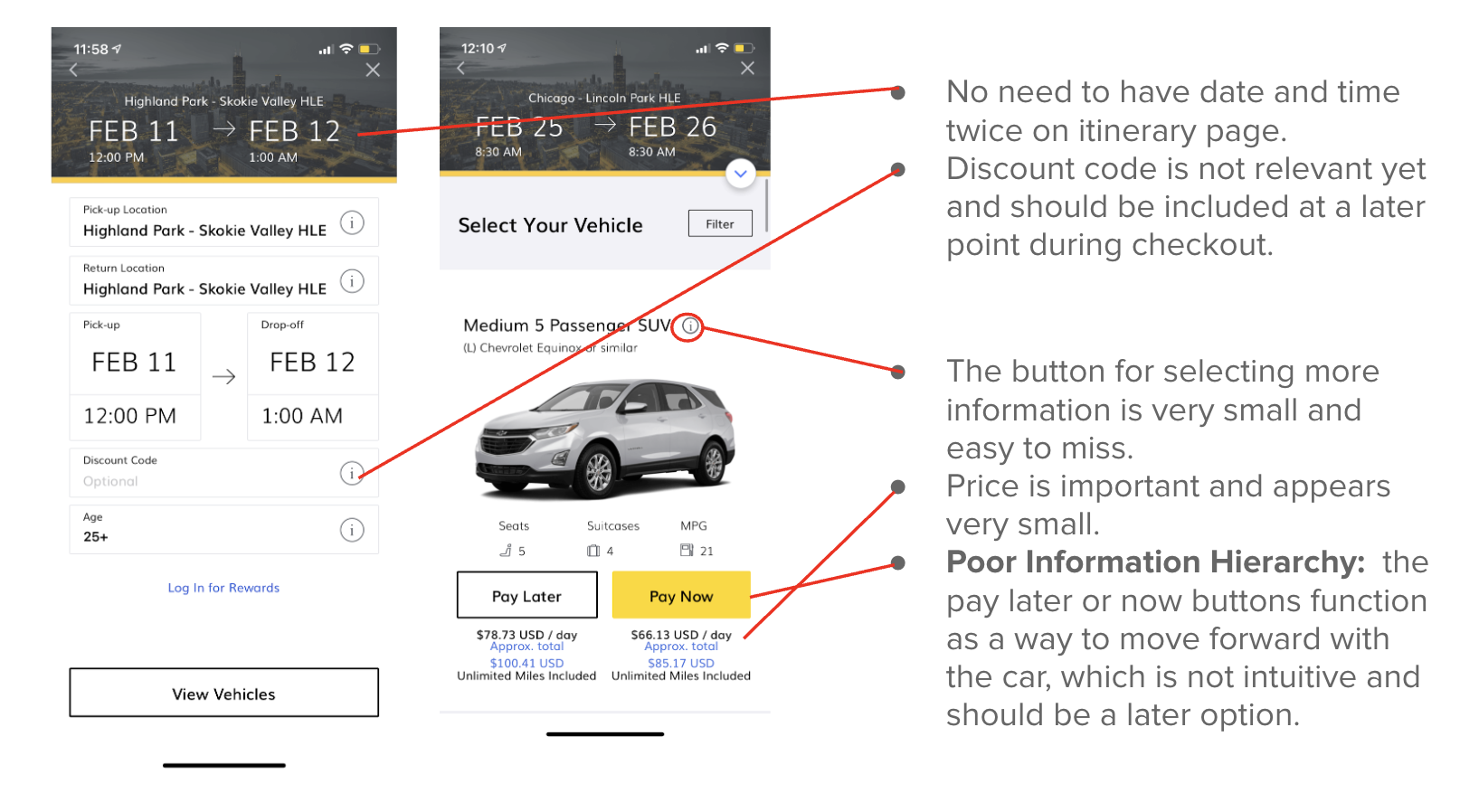
Irrelevant personal/financial information was asked too early on during the car selection process; this information should not appear until checkout
Insufficient or missing filter options
User Interviews
To gain user feedback, I used convenience sampling to find and interview 2 working professionals who sometimes travel for work. I asked them to each walk me through how they would use the Hertz app to book a car for a business trip. While doing so, I encouraged them to “think out loud.”
I also asked the following questions, which I generated based on my own observation study and competitive analysis:
What are the most important considerations for you when renting a car for work?
What are the biggest frustrations you have faced renting a car for work?
Persona + Journey Map
Following the user interviews, I created a user persona of the app and outlined their needs, desires, and frustrations. Then, I created a journey map in order to illustrate the potential pain points the user may face with the current design of the app.
Solution Proposal
After conducting initial research, I realized with my time constraint it was more important to focus in specifically on certain portions of the experience I wanted to improve. While I recognized countless aspects that could be redesigned, I decided to focus on five keys areas.
-
The “Pay Now” or “Pay Later” button results in an option to select extras, which is misleading to users.
I propose the following user flow: Calendar → Select Times → Location Search → Location Selection → Car Class → List of Options (with option to filter) → Add-Ons → Checkout
-
The calendar should be more intuitive and change in appearance as users select dates.
The functionality of booking one-day trips must also be improved.
-
Price should be more emphasized throughout vehicle selection process.
-
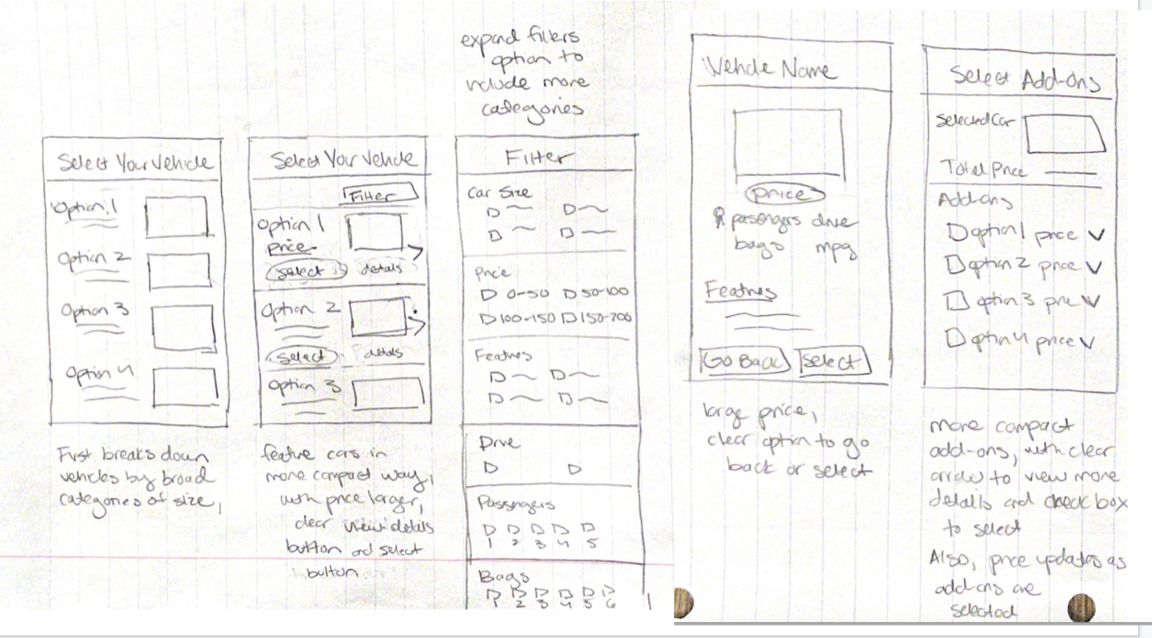
Users expressed a desire to see more car options initially, rather than have one car fill up the entire screen. The same was said about add-on features.on
-
The filters should sort through more categories and be more specific. Users know what they want in some capacity, and want to more accurately refine their search accordingly.
From research, users expressed interest for: MPG, number of Seats, number of Suitcases, safety features, number of doors, price ranges and drive
Low-Fi Prototype
I began with low-fi prototype using pencil and paper. I spent about 15 minutes sketching out my ideas based on my research and initial ideation.
High-Fi Prototype
Due to the time constraint, I was not able to create a mid-fi prototype or get any user feedback during the prototyping process. Instead, I moved directly to translating my low-fi prototype into a high-fi prototype in Figma.
Reflection
-
Looking back on this design challenge, there were two main limitations:
Time constraint: this prevented me from interviewing more people, gaining feedback on prototypes before moving to high-fi prototypes, and implementing every change I wanted to
Bias: due to the small sample group for research
-
With more time, I would…
Conduct more user research on a more diverse range of individuals
Input a “Compare Options” feature, that allows a consumer to select 2 cars at a time and compare their features/prices.
Create an option that allows a consumer to save a preset “type” of car reservation, meaning a specific location, car, and potentially hours of rental as well.
Improve the map feature for searching for locations
Make the car description page more visually appealing and less cluttered
-
This Hertz redesign challenge was the first timed design challenge I had ever completed. It made me narrow in on my design toolkit and identify the most important aspects of the research and prototyping phases. I realized that in this constrained design challenges, there may not be the opportunity to implement every change identified in research, but it is important to prioritize a user’s needs and identify areas with the most impact.


